Category Archives: Part 5

Exercise 5.7 – Prepare an Artists Statement

This exercise asks the student to spend an hour or so researching and reading artists statements. Most of the artist’s statements can either be found on their own websites or on the website of the art galleries representing the artist.

The student is then asked to write an artists statement to accompany their self-directed project which will cover the work produced for Assignment 5.

I produced the following statement to accompany my work:


My current work looks at landscape, lost history, accessibility and land ownership today. Through the examination of the landscape, the people using it and the threats affecting it, the work will drive conservation on how man-made change of the landscape disconnects the land from its own history and how these ongoing changes relate to accessibility for disabled people to explore.

I am interested in the work of other artists and what I can learn from them. Specifically, I am exploring the techniques and methodology they used to approach landscapes and how they portray them. As subsequently how I can apply these to my photography. My series, Doocots of East Lothian, takes as its starting point an incomplete survey undertaken in 1931, which was published posthumously in 1939 and then left unexamined until now. I am applying the new topographic principle to the subject and am producing a sequence of images within a certain container of that aesthetic.


Exercise 5.6 Context as a Determinant of Photographic Meaning. 

This exercise asks the student to read, consider and makes notes of John Walkers essay “Context as a Determinant of Photographic Meaning. 

Walker opens his essay by asking the reader to consider a wedding photograph and the many differing contexts in which the image could be displayed; for example, within a photo album or as a framed picture on a mantlepiece. The photograph can be contextually read as a precious image which has personal value to the owner or if the image is displayed in the window of a commercial photographer, the photograph can be read as an example of their skill and competence. Although the image itself has not changed, the context in which it is displayed changes the context and its meaning to the viewer. 

I agree with Walker in making this assertion, for even if the framing of the image is exactly the same, the image is limited in context to what is seen within the frame. The viewer asked to consider only what is within the frame and not what was captured outside of the frame at the time. The context in which the image is presented, architecturally and socially, changes the reading of the image. 

The essay then examines the process of the resulting change of context by presenting additional information. This can be done either textually, presenting the image as part of a sequence, or presenting the image within the wider context of an exhibition. This provides the viewer with the opportunity to analyse the image with a wider view of the “reality” of the image.  

Once again I agree with this concept. Placing an image within an exhibition of images allows the content to build upon itself to provide a greater context within which to read the image. This allows a greater understanding of what is presented whereas titles are displayed, further detail is given as notes and the viewer can read each image as part of the greater whole. 

Walkers essay moves on to consider the effect of mobility of images. He does this by concentrating on the mechanical process of the photograph and the many differing contexts that an image can hold at the same time. Photographs – due to their ease of repeated production – allow a single image to be presented in differing contexts easily due to the way that they are presented. Two copies of the same image can have different contextual readings depending on how they are presented. Walker uses an image presented in a newspaper and the same image presented within the “white walls” of a photographic journal as his example to demonstrate this. Both are publications, but the image is presented differently creating two different readings of the image. 

He then goes on to present the idea of an image as a lifespan, not only considering the birth of the image, but the life of the image, and how and when it is presented. Walker borrows the terms ‘circulation’ and ‘currency’ from John Tagg. Tagg originated the idea of an image as money and how the image will move from context to context as it is presented in differing situations before the image finally disappears either due to destruction or being “banked” and forgotten in an archive. 

This is an interesting idea which I had come across but never conceptualised. Walker and Tagg both present the idea that not only will an image change hands over the years, but the reading of the image will change too. For example, Eddie Adams ‘Execution of Nguyễn Văn Lém’ when it was first published depicted what was happening in Vietnam during the conflict from a reportage point of viewWithin a fairly short period of time, the photograph took on the context of being an anti-war image,  having been used by the protesters to show the cruelty and meaningless of the Vietnam war. This use of Adams’ image has been surpassed with anti-war protesters using newer and more recent images from the internet; inside Abu Ghraib prison for example. However, these new images have already been replaced in the wider human consciousness due to the rapid evolution of the situation and of the news cycle. Adams. image continues to be printed in publications and shown in academic circumstances, however, it is still presented in an anti-war context rather than the original reportage use. 

Walker essay goes on to examine the work of Jo Spence and her exhibition ‘Beyond the Family Album’. walker posits that the reading of the image changes when the context of the exhibition changes. Quite simply the images can be read differently depending on when and where they are presented. Walker invites the essay reader to examine their perception and understanding of people who visit art galleries, What are the visitors expectations, why are they there, and what is the main driver for them attending a gallery or a specific exhibition within a  gallery? Research and analysis via survey of visitors can help to give an understanding on this abstract idea and provide an understanding on why the visitors are there and how they understand the context of the exhibition. 

Walker closes his essay by presenting the fact that a viewer of an image, no matter the context, will have their own preset concept of the context, mainly created through human memory. That viewer will first use this to read an image when they encounter it. Being aware of these preset contexts can assist the photographer when creating the context in which they wish to present the final set of images. Walker reminds the reader that pictorial stereotypes are everywhere, even within our own conscious and unconscious minds. As to the ideology that all individuals are different, therefore all individuals will read an image differently; I concur with Walker’s opinion that individuals are in fact part of a set or subset and therefore, due to commonality, will read an image within the same context due to a shared lowest common denominator, especially when you regard the concepts put forth by Barthes on Semiotics.   

The exercise then asks the student to design a draft for an exhibition of work which is being produced for Assignment 5.

I have designed the exhibition so that the images are displayed on a curved wall. The images will be displayed in 3 columns, the middle row should be easily accessible by a wheelchair user. The images which will be framed A4 prints will have no glass in them, to allow the braille dots to be read.

2D overhead layout of gallery display for exercise 5-6

Exhibition design for exercise.


References 

CBS News, 2004. Abuse Photos II. CBS News. Available at: https://www.cbsnews.com/pictures/abuse-photos-ii/ [Accessed October 3, 2019].
Anon, 2019. Iraq Prison Abuse Scandal Fast Facts. CNN. Available at: https://edition.cnn.com/2013/10/30/world/meast/iraq-prison-abuse-scandal-fast-facts/index.html [Accessed October 3, 2019].
Anon, John Tagg. PhotoPedagogy. Available at: https://www.photopedagogy.com/john-tagg.html [Accessed October 3, 2019].
Ruane, M., 2019. A grisly photo of a Saigon execution 50 years ago shocked the world and helped end the war. The Washington Post. Available at: https://www.washingtonpost.com/news/retropolis/wp/2018/02/01/a-grisly-photo-of-a-saigon-execution-50-years-ago-shocked-the-world-and-helped-end-the-war/ [Accessed October 3, 2019].
Anon, Saigon Execution | 100 Photographs | The Most Influential Images of All Time. Time. Available at: http://100photos.time.com/photos/eddie-adams-saigon-execution [Accessed October 3, 2019].
Walker, J.A., Context as a determinant of photographic meaning. Academia.edu. Available at: https://www.academia.edu/11911020/Context_as_a_determinant_of_photographic_meaning [Accessed September 21, 2019].

Exercise 5.5 – Create A Slideshow

The exercise asks the student to prepare a Slideshow to present their ongoing work with Assignment 5. 

The exercise asks the student to consider a few points when creating the slideshow. 

  1. Is the Slideshow the most appropriate treatment for the work? 
  1. The length of the slideshow, how long will it run? 
  1. What relevant audio or textual material will accompany the images? 
  1. Consider the relevance of any music used? Ensure if music is used that it is available and suitable for use, and credit the artists. 

The exercise ensures the student that complex software such as Final Cut is not required and that the student should familiarise themselves with whatever software they plan to use. 

At first, I was tempted to use PowerPoint for the slideshow, but after looking at the application, I felt it did not meet my needs. I then considered Windows 10 Videomaker but found again that the software did not meet the requirements I had. In the end, I used Nero Video which I was familiar with and while it did not have all the refinements I wanted it suited the exercise. 

 Gathering more of the work together I decided to continue to use the alphabetical sequence as it fitted with the original document which started the project and guided the brief. 

After processing the images, I worked out a template for the images and the text and started to create the slideshow. I was heavily influenced by “Looking at the Land” curated by Andy Adams, which I viewed in the previous exercise. I really like the clean, clear layout and I felt it was suitable for the treatment of my work. 

Once I had the images in sequence within the application, I started to examine the look and design and tweaked the layout slightly. Then I watched the slideshow and changed the timings to allow more time for the viewer to read each image. 

After draughting and finalising a narration piece, I used Audacity and Lame to produce the narration. Slicing the narration into paragraphs which then allowed me to move them about to improve the timing and sequencing.  

Once I had changed the timing on the images to fit the narration better and again increase the amount of time for each image, which now also included a transition. I felt that there were still too many quiet moments in the slideshow, so I chose a piece of music available via creative commons, the piece was chosen because it met the requirements for a peaceful Celtic sound. 

Once again, I reviewed the slideshow adjusting the timings to suit what I wanted. Even in the final version, I am still not happy with the transitions, but it was one of the few which were not too over the top. 

The slideshow can be viewed below. 


Conclusion

On review, while the exercise has introduced the treatments of online exhibitions to me for my own work, I am not sure that it is the correct treatment for the Assignment. 

I feel that the presentation, being Audio/Video, does not meet the requirement of the brief, which is to make a number of accessible pieces which can be viewed and touched by individuals with visual impairments 

I will however not discount the concept of an online exhibition as it is a good way to show and display certain works. 


Exercise 5.4 – Online Exhibitions

The exercise asks the student to examine the post by Sharon Boothroyd on the WeAreOca website and watch the online exhibition of work.

The online exhibition is Looking at the Land — 21st Century American Views which was curated by Andy Adams for the website Flakphoto.

The exhibition is an interesting view of the American landscape and the lives of the American people and how the interact with the landscape.

We are asked to leave a comment on the WeAreOca page; a copy of which I have pasted below.

Initially, I was taken aback by the silence but quickly reflected on the position of the curator, who would have had the impossible task of finding and fitting a sound to each image. Such as clash would have interrupted the peacefulness of the exhibition.

Watching full screen, in a darkened room, allowed me, as the viewer to concentrate on each image and examine the representation and context of each image. I did not pause or manipulate the timing, but let the Vimeo video to run at the pace decided by the Curator (Andy Adams).

Overall, it gave an interesting view of the ongoing changes within America, while we have suburban views, industry peaked over from the background. Sand dunes representative of Ansel Adams images, had powerlines running through the image, demonstrating the ongoing changes made by man on the landscape.


Exercise 5.3 – Print on Demand Mockup

The student is asked to familiarise themselves with the process of print-on-demand applications and experiment with book design by supposing that that for this exercise that they will be producing a book to present their photographs for Assignment 5. 

The exercise suggests setting up an account with a print on demand service, such as Blurb, Blookup, Lulu, or tradeprint. 

I downloaded Blurbs Bookwright software, as it fitted the profile of the exercise, was simple to use and provided the required print to PDF feature. 

Before I started working on the proof, I examined the rationale for printing my work for Assignment 5. To be honest I am not quite sure that the brief and the work fits in with being presented as a book.  

As part of the exercise, I returned to browsing a number of monographs and art books to try and get familiar with the differing styles of layout, editing and sequencing of the images. Two books stood out as either end of the spectrum 

The first is Sons of Sinbad (Villers, A, 2006), which documented Villers journey from the Red Sea to Kuwait on Dhows between 1938 and 1939), the book contains hundreds of monochrome photographs of not only the people but their cultures and landscapes. Each section comes with a map and very detailed text on the journey.  

The second is Land (Godwin, F, 1985), once past the introductory text, the reader is left to browse through the photographs as they jump geographically around the country. The images presented on ivory paper, allow the monochromic images a chance to define themselves and stand out from the page. 

I feel that the work I am producing for Assignment 5 is closer in nature to Godwins Land, then to Villers, Sons of Sinbad. Although having given it the subject a lot of thought, the work could be expanded in detail, to become a similar style. 

The main stepping stone for me was the introduction, similar in nature to a musical piece, without a good hook, it can be difficult to draw the audience in, so I muddled over the introduction for some time. 

While the work for the Assignment is not complete, I have attached the PDF to this part of the learning log as required by the exercise. I still have quite a bit to go to complete the Assignment. 

doocots mockup

Certainly, the exercise has taught me several lessons. One of which is that my design skills need a good polish and I have quite a bit of learning about the layout and design of a book. Overall this has been an interesting exercise as it has pushed me to explore different options for displaying my work and made me consider how I can expand on a brief to produce a different piece of work later on. 

References 

Godwin, F., 1985. Land. William Heinemann Ltd. 

Magnus, L., 2013. The Public Catalogue Foundation Oil Painting in Public Ownership Southern Scotland. 1st ed. United Kingdom: The Public Catalogue Foundation. 

Villiers, V., 2010. Sons of Sindbad. (s.n.). 


Reflection on upcoming exercises.

The next two exercises are of great interest to me. During my level 1 course, an exercise asked that I put together a set of photographs as a proposal to the magazine article.

To be honest, I was never happy with the results, it was not the images that let me down, rather it was the presentation and the actual words of the article. I used Lorem Ipsum as the article text and it just did not feel right.

Now, in the next two exercises, I have to present a sample of a book and a slideshow, both of which, to me, must look better presented. It is time, that I, as an artist, start to consider how I want to present my work. For this, I am going to have to battle against my dyslexia and my visual impairment, so that I can improve my work, my presentation skills and my professionalism.

Exercise 5.2 – Print Quotes

The exercise asks the student to search for different companies which offer inkjet and C-Type printing. Then take note of the prices and choices available from each company and then create an imaginary order for a print, preparing the image exactly as specified by the print company.

I decided that the working concept for a print, that a standard A2 size would be suitable for the presentation of an image within an exhibition. I then searched the internet for viable companies who would be able to provide what I wanted.


Company Paper Size C-Type Cost Giclee Print Price per Print
Spectrum Photo A2 Fuji Matt £23.06 ex VAT Not Available N/A
Just GICLEE A2 £20.00 ex VAT
Peak Imaging A2 Satin Matt £11.80 ex VAT Hahnemuhle Photo Lustre 260gsm £19.84 ex VAT
Loxley Colour A2 Lustre £9.94 ex VAT Hahnemuhle Bamboo 290gsm £22.58 ex VAT
The PrintSpace A2 Matt £16.42 ex VAT Hahnemühle Bamboo


£20.84 ex VAT

Given the required durability of the work, as it will be touched, the Giclee prints will have to be highly durable. Given that Giclee prints on Bamboo are fairly delicate, I have reviewed the process and would consider using Haemulid Pearl instead as it is reputed to be highly durable.

PrintSpace offered a sample pack for £6 plus £3 delivery which contained a sample of C-type and Giclee prints on different papers. On receiving the pack I was surprised at the quite subtle differences certain papers had over the quality and definition of the image. I do feel at least a little better informed on their paper quality and print quality.

Coming from a fairly technical background, I was, and at times still, are unconvinced about the quality of inkjet prints. During an exhibition of work at the National Portrait Gallery in Edinburgh, I noticed that one or two of the Giclee inkjet prints which showed line marks and imperfections within the print on display. This appears to have been down to the paper selection used when printing for the exhibition.

I prepared two files using the instructions provided by the PrintSpace company, converting the final image to their print profiles which I downloaded from their website. Following the instructions provided on the website,

https://help.theprintspace.co.uk/articles/1885931-how-to-prepare-your-file-for-print-upload

The first is a C-Type Print – Concorde. It is prepared as 300ppi, A2 Paper Size, 1 Inch Border, Colour Profile is C-Type Kodak Metallic. The final image is shown below (figure 1.)

Exercise 5.2 - Concorde

Fig 1. Concorde


I chose this print type as it provided a very smooth, shiny surface print which made metals really clear.

The second is a Giclee Print – Church. It is prepared as 300ppi, A2 Paper Size, 1 Inch Border, Colour Profile is Hahnemuhle Pearl. The final image is as shown below (figure 2.)

Exercise 5.2 - Desolated Church

Fig 2. Church

I like the harder smoother surface the Pearl provides

Can inkjet be treated as a photograph? Yes, it can, while it is distant from the original processes of development and printing, it provides a modern alternative for printing an image.


Exercise 5.1 – Inside the White Cube

The student is asked to read ‘Notes on the Gallery Space’ by Brian O’Doherty and then make notes regarding the essay.

The modern version of the white cube was first formalised and the rules set by Alfred Barr in the New York MoMA when Barr presented the exhibition “Cubism and Abstract Art” in 1936. Previously to this point, the principle of removing distractions from the viewer and presenting images in a neutral background had been explored by the Third Reich in the 1930s’. The Third Reich’s idea was to remove everything which could clutter the view and use white as a symbol of purity. This principle was reformed outside of the Third Reich with the idea that it reflected the contemporary ideas of the Bauhaus style.

By creating a white cube it becomes a neutral space, where the viewer stands outside of time, outside of space. The viewer is separated from the current world and placed in an empty space where there is nothing but the art. By closing off windows, removing the colour from the walls and hiding the lighting, the art and the viewer are placed together. This allows the artist, curator, dealer and exhibitor to control the content within the space, by changing the context within which the art is presented. In doing so it changes the relationship between the viewer and the subject by blurring the boundaries, allowing the space within the cube itself to become art, by not merely containing the art buy by being part of it.

Prior to the development of the White Cube principles, art was displayed in a Salon style, where paintings were hung in any available space and the viewer had to pick and choose between the cacophony of images. Gallery salon walls became crowded places as collections grew. O’Doherty used the example of Samuel F.B.Morses’ ‘Gallery of the Louvre’ as an example of the crowded, less reverential gallery.

part 5 - white - cube - Gallery_of_the_Louvre_1831-33_Samuel_Morse

Samuel F. B. Morse, Gallery of the Louvre, 1831–33, Oil on canvas, 73 3/4 x 108 in. (187.3 x 274.3 cm) Terra Foundation for American Art, Daniel J. Terra Collection 1992.5

O’Doherty is correct in stating that the scene within Morse’s painting would be ‘upsetting to the modern eye’. Within the scene, I find it difficult to differentiate between the images. They seem to arranged randomly as if to fit within any available space. Much like the 16th Century Mural paintings of Duso and Battista Dossi, the paintings become wallpaper, although unlike Dossis ‘Camera delle Cariatide’ it is not a single image, the wall is instead just a device for hanging the art on, rather than contributing to the art.

By removing any abstract distractions from the viewer, including too much information, the gallery became a reverential space, much in the vein of a religious space; quiet, introspective, a space to think without the influences of the outside world. Unlike the Salon space which was bustling with people who had come to see the works, the white space started to become a more exclusive domain.

The perception that you had to know something about the art on display became the norm because most of the contextual information was removed, as it was seen to interrupt the space. In doing so the white cube became the locale of the knowledgeable and the educated rather than the gallery as a salon where it was a crowded, more egalitarian gathering.

The white cube reinstated the wall as something more than where a picture was hung, it broke the boundary of the frame; in a salon space, the image is a self-contained entity, quarantined from its neighbour. In breaking the boundary, for example, when William C. Seitz removed the frames from the Monet’s at his MoMA show in 1960, it allowed the viewer to see the scene beyond the frame, in essence almost a return to the image as a mural.

Within the isolation of the white space, without the heavy frame, the image and the art were less restricted, as was the eye of the viewer. It allowed the viewer to look beyond the image without the loss of perspective. The white wall aesthetic also allows each image space within which to exist without overlapping into the next image. In the codified parlance of the white space, each individual piece of art is given a space to breathe.

The white cube aesthetic has sometimes been comfortably combined with a salon exhibition. At the National Gallery of Art in Edinburgh, the Rembrandt exhibition was topped and tailed with a white cube; a projected introduction by the curator which contained a potted history of Rembrandt and an explanation of the layout of the exhibition. The viewer was then allowed to proceed to a salon-style exhibition, where images with heavy frames were hung on a green wall. The images although close together were placed in such a way that the viewer did not have to crouch or stretch their neck to see the images, as they were hung in a line rather than crammed together. Only in the case of Belshazzar’s Feast, was the viewer confronted by a Salon type scenario, where the image was placed between the two openings to another room, completely filling the space.


part 5 - white cube - Belshazzars Feast - Rembrandt

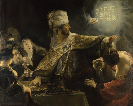
Rembrandt, Belshazzar’s Feast,1636-8, 167.6 x 209.2 cm, National Gallery, London

The exhibition ended in another white cube, in which modern images inspired by Rembrandt had been hung. Personally, the space was too small and ineffectually displayed the images as they were crammed together ironically salon style.

Certainly, one of the issues to come out of the gallery as a white cube is where to store the images which are not on display and which ones should be shown and how. This developed the curator into a manager, collector and designer. The curator juggles the collection and manages the throughput of the art in association with the exhibitor and the artist.

The National Gallery also exhibited a number of Toulouse Lautrec prints within another part of the gallery. The prints hung, high on the wall, in the brightly light space, the white rooms, at time corridor-like, shuffling the viewer from print to print, before ending in a chamber where the paintings of Lautrec were finally displayed. Due to the shape of the galley, it was at times quite crowded and noisy.

Some exhibitions are hampered by trying to be too much of a communal art space, the City Art Centre in Edinburgh, exhibits modern images within the white cube aesthetic, but it does not always pull it off. In its Robert Blomfield exhibition of photographs of 1950s-1970s Edinburgh, the room met the aesthetics of the white cube’ white walls, hidden lighting, polished floor and images placed around the rooms in light frames. The exhibition guided the viewer through the exhibition with a small stop to view a projected interview with Blomfield as he described and discussed the photographs he had taken. In contrast to this was the Scottish photography exhibition which was downstairs at the City Art Centre. There the room did not meet the aesthetics. Although it was a white space, the room was dark and poorly light, the floor was uneven, and the images crowded together in a horizontal line. The room used for the exhibition was dual purpose, with a child’s play space in the middle, which meant the room was not quiet and contemplative.

Both the salon aesthetic and the white cube aesthetic have a valid space within the gallery. In the scene of a modern space, to present a modern take on art, it has come into its own, especially with the concepts of installations and room art. While it may have lost a little of its religious, revenant aspect, the quiet contemplative space in which to view art without distraction and allow the viewer to commune with the art itself is still present.

From a personal point of view, the white cube is both heaven and hell. With uniform lighting, I do not have to fight with highlight and shadow to see an image. The colours will be the same day in day out. The downside, of course, is that with limited vision, I cannot read or see the details of the image thus excluding me from the experience.

 References

O’Doherty, B., 1986. Notes on the Gallery Space. Inside the White Cube: The Ideology of the Gallery Space, [Online]. First Edition, 7-32. Available at: http://arts.berkeley.edu/wp-content/uploads/2016/01/arc-of-life-ODoherty_Brian_Inside_the_White_Cube_The_Ideology_of_the_Gallery_Space.pdf [Accessed 4 June 2019].

Garage. 2019. Inside the White Cube: The Ideology of the Gallery Space. [ONLINE] Available at: https://garagemca.org/en/publishing/brian-o-doherty-inside-the-white-cube-the-ideology-of-the-gallery-space. [Accessed 13 June 2019].

Abigail Cain. 2019. How the White Cube Came to Dominate the Art World – Artsy. [ONLINE] Available at: https://www.artsy.net/article/artsy-editorial-white-cube-dominate-art. [Accessed 13 June 2019].

Nicole Lanctot. 2019. When White Is Wrong -ARTnews. [ONLINE] Available at: http://www.artnews.com/2010/02/01/when-white-is-wrong/. [Accessed 13 June 2019].

Super User. 2019. Zimmerman Art Gallery – Why do galleries have white walls?. [ONLINE] Available at: http://www.zimmerman.co.nz/insider-info/44-why-do-galleries-have-white-walls. [Accessed 13 June 2019].

Hopes&Fears. 2019. Why are art galleries white cubes?—Hopes&Fears. [ONLINE] Available at: http://www.hopesandfears.com/hopes/now/question/216781-why-are-art-galleries-white-cubes. [Accessed 13 June 2019].

The white cube and beyond | Tate. 2019. The white cube and beyond | Tate. [ONLINE] Available at: https://www.tate.org.uk/context-comment/articles/white-cube-and-beyond. [Accessed 13 June 2019].

MoMA. 2019. MoMA | Small Steps Lead to Bigger Changes: MoMA’s Shifting Wall Colors. [ONLINE] Available at: https://www.moma.org/explore/inside_out/2010/03/11/small-steps-lead-to-bigger-changes-moma-s-shifting-wall-colors/. [Accessed 13 June 2019].

National Galleries of Scotland. 2019. National Galleries of Scotland. [ONLINE] Available at: https://www.nationalgalleries.org/. [Accessed 13 June 2019].

Museums and Galleries Edinburgh. 2019. City Art Centre | Museums and Galleries Edinburgh. [ONLINE] Available at: https://www.edinburghmuseums.org.uk/venue/city-art-centre. [Accessed 13 June 2019].